
AI
SaaS
Design System
UX Research

Product Devfolio
Devfolio is a hackathon and builder platform that runs the full event lifecycle, from application and submission to review and final decisions. Organizers use it to host hackathons at scale, while hackers use it to apply, build, and submit. The platform serves everything from small community events to flagship hackathons with tens of thousands of participants.
Details
Mobile + Tablet app
Web App
Product Designer
UX Design
Design System
User Research
User Testing
Team Members
Product Manager
Engineering Lead
Frontend Developers
AI Review · User Research · Design System · User Testing
Scope
Problem Reviewing at a Scale Humans Couldn't Match
Every hackathon drew 5,000 to 10,000 applications, and organizers had to filter them by hand under tight decision windows. Reading each one closely was impossible at that volume, so reviewers fell back on shallow signals and risked missing strong builders.
Solution AI That Reads First, Humans Who Decide
I designed an AI evaluation layer that organizers can tune to their own bar. They weigh signals across GitHub, Devfolio history, and application answers, using presets or custom prompts per dimension. The AI reads every application against that config and surfaces a score, summary, and key signals, so reviewers scan its read first and then decide. The layout kept the review rhythm organizers knew while leaving room for new AI dimensions as the platform scales.
Result Faster Reviews, Without Losing the Call
Reviewers could move through thousands of applications without reading each one cold, spotting strong builders faster and spending their attention where it mattered. Organizer interviews shaped what signals the AI surfaced, and live testing in Devfolio's DevRel environment validated the flow before launch. The structure left room for future review dimensions, giving the team a foundation to expand on rather than rebuild.
Projected Impact Validated from posthog metrics
3 dimensions
Weighted dimensions, fully tunable.
GitHub, Devfolio history, and application answers, configurable by preset or custom prompt.
5K-10K
Applicaitons per hackathon
The review volume per event the AI layer was built to handle.
DevRel
Validated before launch
Tested live in Devfolio's environment, with reviewer behavior tracked in PostHog.
COntext
Devfolio is a hackathon platform where popular hackathons draw thousands of applications that an organizer has to review.
Every hackathon drew 5,000 to 10,000 applications, and organizers had to filter them by hand inside tight decision windows. Reading each one closely was impossible at that volume, so reviewers leaned on shallow signals and risked missing strong builders. I picked this up as the sole designer, leading research, design, and testing on an AI evaluation layer that reads every application and helps reviewers move fast without giving up the final call.
Problem
Popular hackathons drew 5,000 to 10,000 applications, far more than any team could read closely. Reviewers fell back on shallow signals, and strong builders slipped through.
At that volume, hand review stopped working. Organizers had a narrow decision window before a hackathon began, and reading each application properly was impossible, so they skimmed names, scanned a few links, and made fast calls on thin evidence. The cost was twofold. Promising builders with weak-looking profiles were filtered out, and the reviewers burned hours on work that still felt unreliable. Organizer interviews confirmed the pattern, and PostHog sessions showed reviewers stalling on the queue and abandoning it mid-pass. The applications held the right signal; the experience couldn't surface it fast enough.
Goals + North Star
To give organizers a fast, trustworthy way to review thousands of applications, surfacing the strongest builders without forcing anyone to read every entry by hand or hand the decision to a black box.
Speed at Volume: Let reviewers move through 5,000 to 10,000 applications in a fraction of the time, without skimming blindly.
Keep Humans in Control: Position AI as a first read, not a verdict, so organizers always make the final call.
Tunable to Each Bar: Let organizers weigh signals and write their own criteria, since every hackathon judges differently.
Fit the Familiar Flow: Add AI into the review rhythm organizers already knew, so the feature felt like a help, not a relearn.

Process + Key Insights
I interviewed organizers running high-volume hackathons, watched PostHog sessions of reviewers working the queue, and tested the feature live in Devfolio's DevRel environment to map where the review broke down and what reviewers actually trusted.
Key Insight 1: Volume Forced Shallow Reads. At 5,000 to 10,000 applications, reviewers couldn't read each one, so they judged on a glance at a link or a familiar name. Strong builders with plain profiles got filtered out, and reviewers knew the calls were unreliable.
Key Insight 2: One AI Score Wasn't Enough. A single number told reviewers what, but not why, and they didn't trust a verdict they couldn't see into. They needed the reasoning surfaced, a score plus a summary plus the specific signals behind it, to act on it confidently.
Key Insight 3: Every Hackathon Judges Differently. A Web3 event, a beginner hackathon, and a sponsor-track event value completely different things. A fixed evaluation couldn't serve all of them, so organizers needed to weigh signals and set their own criteria.
REVIEW BEFORE AI
The old review was a flat list. Name, date, status, with no signal for who was worth a closer look, so reviewers read applications cold, in list order.
Organizers opened applications one by one, from the top of the list, and set a status by hand. Nothing told them which of the 1,300 to 10,000 applicants deserved attention first, so every entry got the same shallow read or none at all. The filters made it worse than it looked: Start Reviewing ignored them entirely, dropping reviewers back at the first application no matter what they had narrowed to. The result was slow, inconsistent, and blind to strength. Strong builders with plain profiles were as likely to be skimmed past as anyone else.

What was broken: A flat list with no signal for who mattered, statuses set by hand, and a Start Reviewing button that ignored every filter you set.
IDeation - REVIEW DASHBOARD
The reworked dashboard turned the flat list into a prioritized queue. An AI Scores column, sortable and filterable, with the live evaluation weighting always visible above it.
The list kept the shape organizers already knew, name, date, status, but added a score column they could sort and filter by, so the strongest applicants surfaced to the top instead of sitting buried in submission order. The AI Evaluation panel stayed pinned beside the stats, showing exactly how scores were weighted across GitHub, Devfolio, and application answers, with Edit Rubric one click away. Nothing was hidden behind a setting. A reviewer could see the scoring logic and the results in the same glance, and the fixed review loop now respected whatever filters they had set.

Added an AI score filter backed by a distribution chart and the average score, so reviewers can see where applicants cluster before choosing a cutoff instead of guessing. And fixed Start Reviewing, which used to ignore every filter, to follow the narrowed list so reviewers work only on the applicants they meant to.

IDEATION - APPLICANT PREVIEW
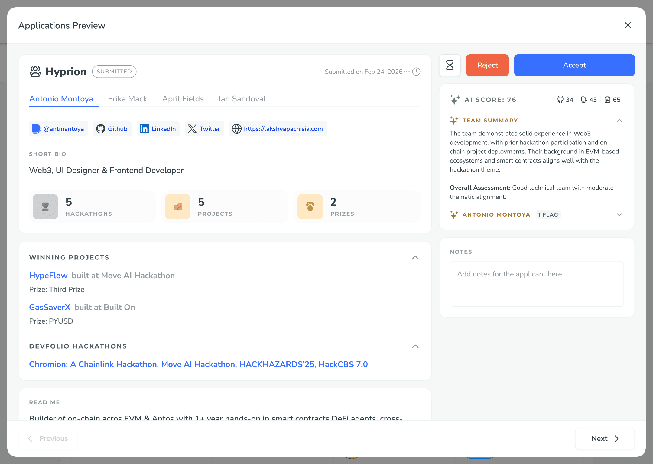
The old preview showed everything and concluded nothing. Stats, links, projects, and bio, all raw, leaving the reviewer to assemble a verdict by hand. The rework added a scored, reasoned read beside the same profile: an AI score with its dimension breakdown, a team summary, and per-member flags.
Every signal was already on the screen, just unweighted, so reviewers scrolled through links and project lists and built the judgment themselves, entry after entry. The rework kept all of that but added the AI's read alongside it: a score split across GitHub, Devfolio, and application signals, a short summary of the team, and flags that call out specifics like a skill the application claims but the projects don't show. The reviewer now confirms a read instead of constructing one, with Accept and Reject sitting right where the decision gets made.

Thank you. To understand more in-depth, let's connect.