
CRM-ERP
Mobile App
SaaS
Field Operations

Product ZenTrades
ZenTrades is a CRM and ERP platform built for trade businesses, including HVAC, plumbing, fire protection, and electrical. It brings customer management, scheduling, dispatching, job tracking, invoicing, and reporting into a single platform, helping business owners and office staff run every part of their operation from one place. The platform serves trade businesses ranging from small crews to large multi-location operations.
Details
Mobile + Tablet app
Web App
Product Designer
User Experience Design
Design System Management
User Research
User Testing
Team Members
Product Manager
Frontend Developers
CRM-ERP · User Research · Design System · User Testing
Scope
Problem A Platform Too Complex to Use
ZenTrades had grown into a product that was hard to learn and harder to keep using. Information was scattered across modules, navigation was broken, and basic tasks required too many steps. New customers struggled to onboard, and existing users constantly got lost between screens. The UI was inconsistent, the frontend needed a full rebuild, and the complexity was slowing down every business that depended on it.
Solution One Workspace, Everything in Reach
Rebuilt the CRM from the ground up with a three-panel layout that puts customer information, activity, and module data on a single screen. Forms moved out of modals into single-scroll experiences with fewer clicks. A new design system brought consistency across every module, and the architecture was built to scale with future AI features.
Result Best in Class, Proven in the Field
Onboarding time for new customers dropped from 25 to 35 days to 12 to 15 days, even for large accounts pulling in millions in revenue. The modular rollout let existing customers move to the new experience at their own pace, and adoption happened willingly. The new design system gave the team a foundation to build faster, ship more consistently, and open the door to future AI features.
Projected Impact Validated from mixpanel metrics
55%
Faster customer onboarding
Onboarding time for new accounts dropped from 25 to 35 days down to 12 to 15 days, even for large accounts
72%
Faster feature development
A unified design system and component library let the team ship new features at nearly double the previous pace
100/day
Customer and ticket creation at scale
Streamlined creation flows enabled high-volume businesses to add 50 to 100 customers or tickets daily without friction
COntext
ZenTrades is a CRM and ERP platform for trade businesses managing customers, jobs, and operations.
A full redesign had been on the roadmap for a while, but customer feedback and internal pressure made it clear the existing platform couldn't carry the business forward. The UI was inconsistent, navigation was broken, basic tasks took too many steps, and the frontend needed a new tech stack. I picked it up as the solo designer, leading research, design, and the new design system over three months across Customer, Ticket, Scheduler, Invoice, and Estimate modules.
Problem
The platform had grown into something complex and hard to use. Information was scattered across modules, navigation was broken, and basic tasks took too many clicks. New customers struggled to onboard, and existing users got lost between screens.
ZenTrades had been built feature by feature over years, and the cracks were everywhere. The UI was inconsistent across modules, navigation didn't follow how people actually worked, and the frontend was held together by an aging stack that slowed every new release. Mixpanel recordings showed users repeatedly hunting for information, abandoning flows mid-task, and leaning on the account management team to complete things that should have been self-serve. Customer interviews backed it up: the platform had the right capabilities buried under the wrong experience. A redesign wasn't optional anymore, it was the only way forward.
Goals + North Star
To turn ZenTrades into a simple, scalable CRM that business owners and office staff can actually run their business from, without hunting for information or fighting the platform.
Reduce Complexity: Cut unnecessary steps, consolidate scattered information, and make every module follow the same patterns.
Speed Up Onboarding: Get new accounts live in weeks, not months, by making the platform easier to learn from day one.
Build for Scale: Set up a design system and component library that lets the team ship faster and stay consistent across modules.
Leave Room for AI: Design the experience so future AI features have a clear place to live, without needing another redesign to fit them in.

Process + Key Insights
I interviewed around 50 accounts incluiding business owners and office staff, dug into Mixpanel session recordings, and ran a competitor analysis to map where the platform was breaking down and what users actually needed.
Key Insight 1: Navigation Was Broken. Users had no clear path between modules. Basic tasks like finding a customer's invoice or checking job status required jumping across multiple screens, and many users simply gave up and called support instead.
Key Insight 2: Filters and Tables Were Frustrating. Filters didn't persist when users left and returned to a module. Tables showed data that wasn't relevant to everyone, creating noise that slowed down daily workflows for high-volume businesses.
Key Insight 3: Complexity Was Killing Onboarding. New accounts were taking 25 to 35 days to get live. The platform had the right capabilities but buried them under too many steps, too many pages, and no consistent patterns between modules.
Ideation - Add Customer
The old Add Customer form was a modal. Tabbed sections, scattered fields, and a lack of clear flow made it easy to miss information and hard to fix mistakes.
The modal forced users to fill out customer details across multiple tabs with no full picture at once. Switching between Address, Attachments, Payment, Billing, and Terms required constant clicking, adding real time to every submission. For businesses adding 50 to 100 customers a day, this friction added up fast.

Ideation - Add Customer Design 1/2
The first concept moved everything onto a single scrollable page, removing tabs entirely and grouping fields into collapsible accordion sections.
Flattening the form into one continuous scroll meant users could see all sections at once and move through them without switching context. The side navigation stayed visible and expanded, keeping the full platform accessible while filling out the form. Mandatory sections were open by default, optional ones collapsed, so the most important information was always front and center.

Ideation - Add Customer Design 2/2
The old Add Customer form was a modal. Tabbed sections, scattered fields, and no clear flow made it easy to miss information and hard to fix mistakes.
The modal forced users to fill out customer details across multiple tabs with no full picture at once. Switching between Address, Attachments, Payment, Billing, and Terms required constant clicking, adding real time to every submission. For businesses adding 50 to 100 customers a day, this friction added up fast. The goal was to flatten it into a single scroll and make the whole experience fast and self-evident.

Ideation - Customer View
The old customer view scattered everything across tabs. Primary information was hidden, and users had to scroll and click through multiple sections just to get a basic picture of a customer.
One Screen, Full Picture: Customer info, quick actions, and the map live in the left panel. Activities and communication sit at the top right, always visible. No scrolling required to find the most important information.
Map Finally Surfaced: The map existed in the platform, but was never made visible. Bringing it into the main view gave users instant location context without opening anything extra.
Activities and Communication Always Visible: Previously split across separate tabs, these are now permanently in view. Users can see exactly what has happened with a customer the moment they open the profile.
Tabs Without Losing Context: Job tickets, invoices, forms, and attachments are still accessible through tabs, but switching between them no longer hides the customer info and activity panels above.
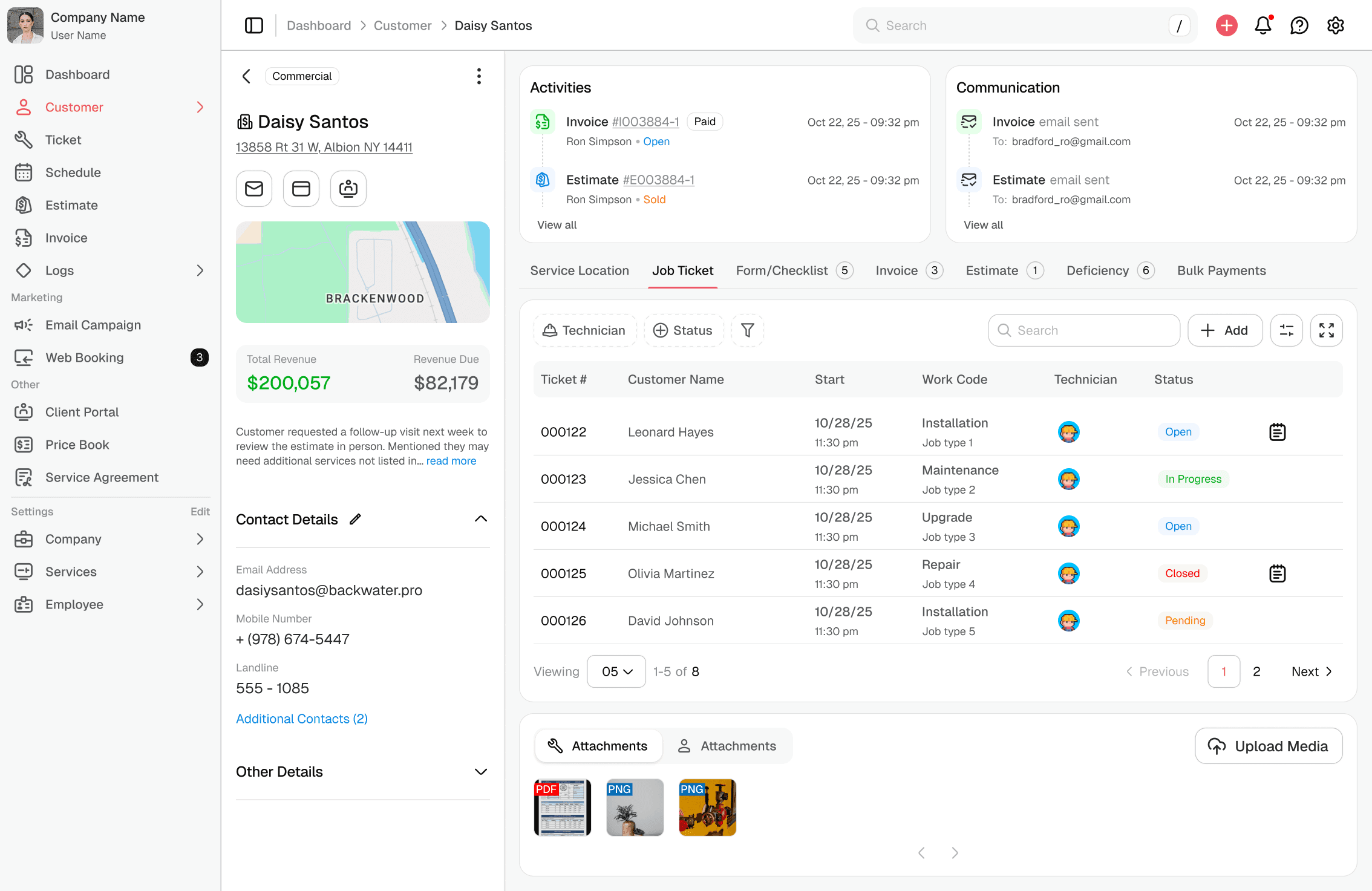
Ideation happened across every module. Not everything can be shared publicly here. Connect with me to explore the full depth of the design process.
Layout
Before designing anything, a 12-column grid and a consistent spacing scale were established. Every margin, padding, and gap follows a fixed pixel scale from 2px to 112px, ensuring the product stays responsive, consistent, and ready to scale.
Responsive by Default: The 12-column grid ensures every module adapts cleanly across screen sizes without breaking the layout or requiring custom fixes per page.
Built for Flexibility: A 12-column base supports everything from a single-column form to a four-column layout, giving the product room to grow without needing a structural rethink.
Consistent Across Modules: Every screen built on the same grid ensures that spacing, alignment, and proportions remain predictable across Customer, Ticket, Scheduler, Invoice, and Estimate.
Navigation That Scales Too: The left navigation was given a fixed standard width, keeping it consistent across the product. On screens wider than 1400px, the center content locks to a fixed max width and centers itself, so the layout never stretches uncomfortably on large monitors.

Design Tokens & Design System
ZenTrades had no design system. Every module looked different. I built one from scratch, starting with tokens and scaling to 32 components and over 540 variants.
Before any UI work began, the foundation had to be right. I defined design tokens for color, typography, spacing, and borders, all following WCAG and ARIA accessibility standards. This was the first design system ZenTrades ever had. With tokens in place, every component built on top of them stayed consistent automatically. The result was 32 components covering over 540 variants, giving the engineering team a reliable library to build from and making future feature development significantly faster and more consistent across every module.

I designed and laid out everything from the foundation myself by starting with design tokens: colours, typography, spacing, borders, and accessibility rules.


Components built on top of the token system, covering every pattern used across the platform.
Thank you. To understand more in-depth, let's connect.